What CPI analysis actually measures
When markets react to inflation data, they aren't just looking at a vague sense of prices going up. They are reacting to a precise, monthly snapshot of the consumer price index (CPI). Understanding what this index actually captures—and what it leaves out—is the first step in making sense of the volatility that follows the Bureau of Labor Statistics (BLS) release.
The CPI measures the average change over time in the prices paid by urban consumers for a market basket of consumer goods and services. Think of it as a thermometer for the cost of living. It tracks out-of-pocket expenditures for housing, food, energy, transportation, medical care, and recreation. If the thermometer rises, your purchasing power falls; if it falls, prices are deflating. This direct link between the index number and your wallet is why the data moves markets so violently.
However, "inflation" is a broad economic concept, while CPI is a specific statistical measure. The BLS calculates two main versions: the Consumer Price Index for All Urban Consumers (CPI-U) and the Chained CPI for All Urban Consumers (C-CPI-U). The CPI-U is the headline number most traders watch. It covers approximately 93% of the total U.S. population, tracking spending habits across different income levels, educational attainment, and geographic regions. The C-CPI-U, which accounts for consumers substituting cheaper goods for expensive ones, tends to rise more slowly and is often used for indexing Social Security payments.
The BLS is the sole authority on this data. Their methodology is rigorous, surveying thousands of retailers and service providers every month. For market analysis, you should treat the BLS release as the primary source of truth. While the Federal Reserve uses CPI data to set interest rates, they do not calculate the index themselves. Relying on third-party estimates or lagging indicators can lead to mispricing assets before the official data drops.
To see how this plays out in real time, you can monitor the current inflation expectations and related asset prices.
The distinction between headline and core, and the strict definition of the basket, matters because it determines how traders interpret the data. A spike in energy prices might push headline CPI up, but if core CPI remains stable, the Federal Reserve may not react aggressively. Conversely, if core inflation rises, it suggests wage-price spirals and entrenched demand, which typically triggers a sharper market response. Understanding this nuance prevents you from overreacting to temporary noise.
Reading the latest CPI report
The Bureau of Labor Statistics releases the Consumer Price Index (CPI) monthly, and the raw numbers tell only half the story. To trade the market moves, you need to separate the signal from the noise by looking at three distinct metrics: the headline year-over-year (YoY) rate, the month-over-month (MoM) change, and the core inflation figure.
The headline CPI is the most cited number, but it is also the most volatile. Energy and food prices swing wildly based on geopolitical events and weather, often drowning out the underlying trend. For a clearer picture of persistent inflation, traders focus on core CPI, which strips out those two categories. The Federal Reserve watches core inflation closely because it better reflects the long-term purchasing power of the dollar.
To visualize the long-term trajectory, look at the CPI All Urban Consumers (CPIAUCSL) trend. This series, tracked by the Federal Reserve Bank of St. Louis, shows the cumulative effect of inflation over decades.
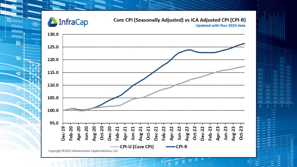
When the report drops, the market reacts most sharply to the month-over-month change. A small beat or miss in MoM data can trigger immediate volatility because it signals the short-term direction of the economy. Use the chart above to see how core and headline metrics diverge during periods of energy shocks, helping you identify whether price pressures are temporary or structural.
How CPI Moves Financial Markets
CPI data releases act as a catalyst for immediate and often violent shifts in asset prices. The market does not simply react to the headline number; it reacts to the deviation between the actual release and the consensus forecast. When inflation data comes in hotter than expected, it signals that the Federal Reserve may need to maintain restrictive monetary policy for longer to cool the economy. Conversely, cooler-than-expected inflation often fuels hopes for rate cuts, driving risk assets higher and safe-haven yields lower.
The most direct transmission channel is the bond market. Treasury yields adjust rapidly to reflect new expectations for the federal funds rate. A spike in yields increases the discount rate for future corporate earnings, which typically pressures equity valuations, particularly in growth and technology sectors. The US Dollar Index (DXY) often strengthens in this environment, as higher yields attract foreign capital seeking better returns on fixed-income assets. This dynamic creates a clear causal link: hotter inflation often means a stronger dollar and weaker equities, while disinflationary trends can reverse that flow.
To understand these movements, it is helpful to view the CPI report as a real-time update on the central bank's policy roadmap. Traders dissect the core components—such as shelter, energy, and services—to gauge whether inflation is truly sticky or transitory. This granular analysis determines whether the market prices in a hawkish pause or a dovish pivot. The following widget shows the current pricing of the US Dollar, which often moves in inverse correlation to inflation expectations when rate cut probabilities shift.
The image below illustrates how specific sectors, such as transportation, contribute to the broader CPI basket. Understanding these component weights helps investors anticipate which industries will be most sensitive to inflationary pressures and subsequent monetary policy adjustments.
For market researchers, the key is to monitor the reaction to the data rather than just the data itself. Often, the initial spike in volatility settles as the market digests the Fed's likely response. Watching how the 10-Year Treasury yield and major equity indices move in tandem with the news release provides a clearer picture of market sentiment than the raw inflation number alone.


As an Amazon Associate, we may earn from qualifying purchases.
Common mistakes in CPI interpretation
Reading the Consumer Price Index (CPI) is often treated as a straightforward math problem, but it is more like reading a noisy signal. Market participants frequently misinterpret the data because they look at the wrong lens or react to the wrong part of the signal. The Bureau of Labor Statistics (BLS) releases a wealth of data, but the headline number is just the starting point, not the finish line.
One of the most frequent errors is treating a single month’s headline CPI as a definitive trend. Inflation data is inherently volatile. A one-month spike in energy prices, for example, can distort the headline figure without reflecting underlying demand pressures. The Federal Reserve and other central banks rely on core measures—excluding food and energy—to gauge persistent inflation. Relying solely on the headline number is like judging a storm’s severity by a single gust of wind; you miss the broader atmospheric pressure.
Another critical pitfall is ignoring seasonal adjustments. The BLS applies statistical models to smooth out predictable fluctuations, such as holiday shopping spikes or back-to-school clothing purchases. If you compare an unadjusted month to a seasonally adjusted one, or fail to account for the adjustment entirely, your analysis will be skewed. Always ensure you are comparing like with like, typically using the year-over-year seasonally adjusted rate, to understand the true trajectory of prices.
Finally, many investors overlook the composition of the index. The CPI is a weighted average, meaning some categories, like shelter, have a much larger impact on the total than others, like used cars. A drop in used car prices might look positive in the headline, but if shelter costs continue to rise, the underlying inflationary pressure remains. Understanding what is driving the number is just as important as the number itself.
Tools for tracking CPI data
You need a single source of truth before you look at market commentary. Start with the Bureau of Labor Statistics (BLS). Their Consumer Price Index for All Urban Consumers (CPI-U) is the official record. If you are building a model or verifying a headline number, go to the source first. It is raw, unfiltered, and completely free.
Once you have the baseline, you need historical context. The Federal Reserve’s FRED database is the best place to put that data to work. It lets you overlay CPI with interest rates or GDP without the noise of financial news cycles. You can see how inflation actually behaved in previous decades, not just how it is being interpreted today.
For quick checks, Trading Economics offers a clean interface, but treat it as a mirror, not a window. It reflects the official data with a slight delay and adds its own projections. Use it for a quick glance, but never for final verification. Relying on third-party summaries for high-stakes decisions is how you get burned.
If you are tracking broader economic pressure, keep an eye on the broader market. You can monitor the S&P 500 to see how equities are pricing in inflation expectations alongside your CPI data.
Frequently asked questions about CPI
How do I interpret rising versus falling CPI?
A rising Consumer Price Index signals that consumer prices are increasing, indicating higher inflation. Conversely, a falling CPI means prices are generally dropping, which can suggest lower inflation or even deflation. When analyzing the latest data, such as the 4.0% year-over-year increase reported by the BLS for May 2026, focus on the trend rather than a single month's headline number to gauge the true direction of market pressure.
What is the difference between CPI and PCE?
While both measure inflation, the Personal Consumption Expenditures (PCE) price index is the Federal Reserve's preferred gauge. CPI focuses on a fixed basket of goods purchased by urban consumers, whereas PCE adjusts for changes in consumer behavior and includes a broader range of expenses. The Fed prefers PCE because it better reflects actual spending patterns and typically runs slightly lower than CPI, offering a more nuanced view of price stability.
Why does CPI matter for market moves?
CPI is a primary driver of monetary policy decisions. When inflation data comes in hotter than expected, markets often price in aggressive interest rate hikes, which can pressure equity valuations and boost bond yields. Conversely, cooler CPI readings may signal rate cuts, supporting risk assets. Traders watch these releases closely because they directly impact the cost of capital and the discount rates used to value future earnings.
No comments yet. Be the first to share your thoughts!